The Hierarchical tree Map is a good way to visualize multiple member hierarchies, or hierarchy levels within one tree map. The data is organized into segments in a hierarchical fashion, based on headers or colors.
The given hierarchies may be different levels of a single user hierarchy, or they may be separate flat hierarchies.
How the Data is Grouped
Group by Headers
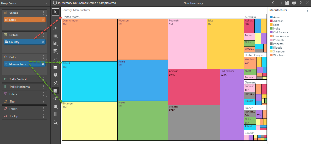
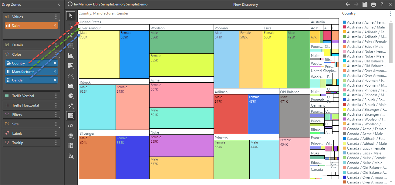
By default, the data in the chart is grouped by headers, starting with the blue chip in the Details drop zone. As in the image below, if the Details zone contains one blue chip, and the Color zone contains one blue chip, the chart will be grouped according to the member element headers from the hierarchy in the Details zone (red arrow below). Each segment will be labeled according to the corresponding member element from the blue chip in the Color zone (green arrow).
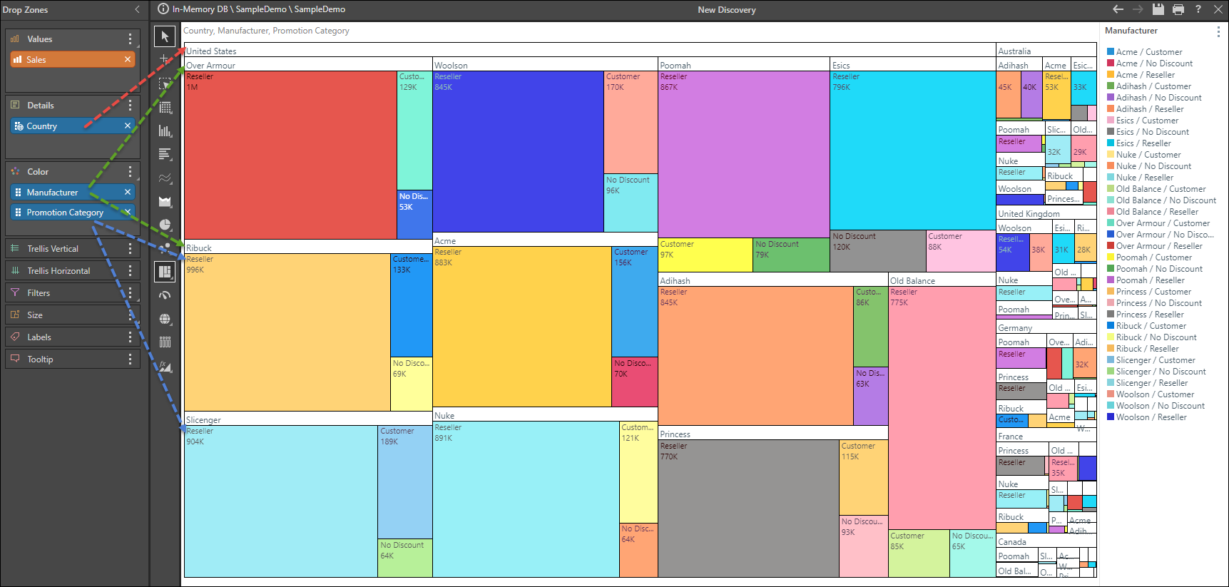
If the Details zone contains one blue chip, and the Color zone contains multiple blue chips, the data will be grouped by the hierarchy in the Details zone first (red arrow below). It will then be organized into subgroups based on the hierarchies in the Color zone, from the uppermost chip (green arrow) to the last (blue arrow).
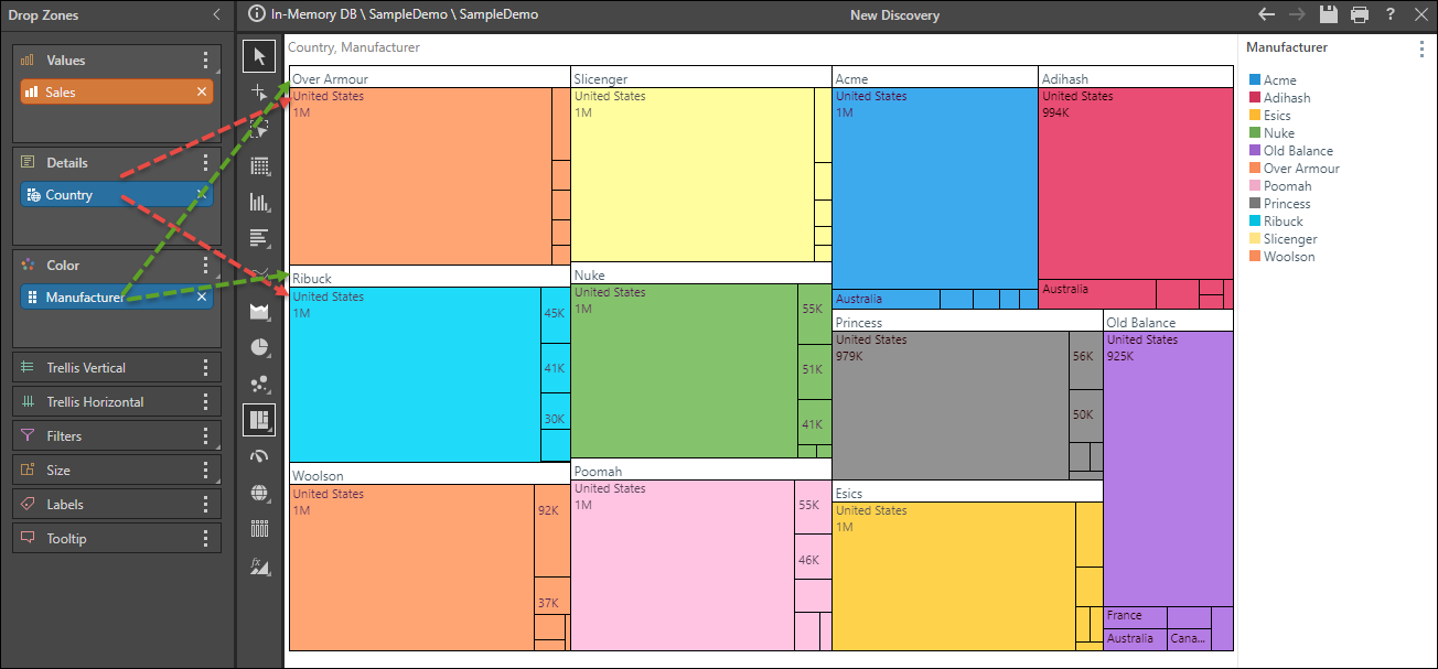
If there is no chip in the Details zone but multiple chips in the Color zone, the data will be grouped by the chips in the Color zone, starting from uppermost chip (red arrow below), to the last chip (blue arrow).
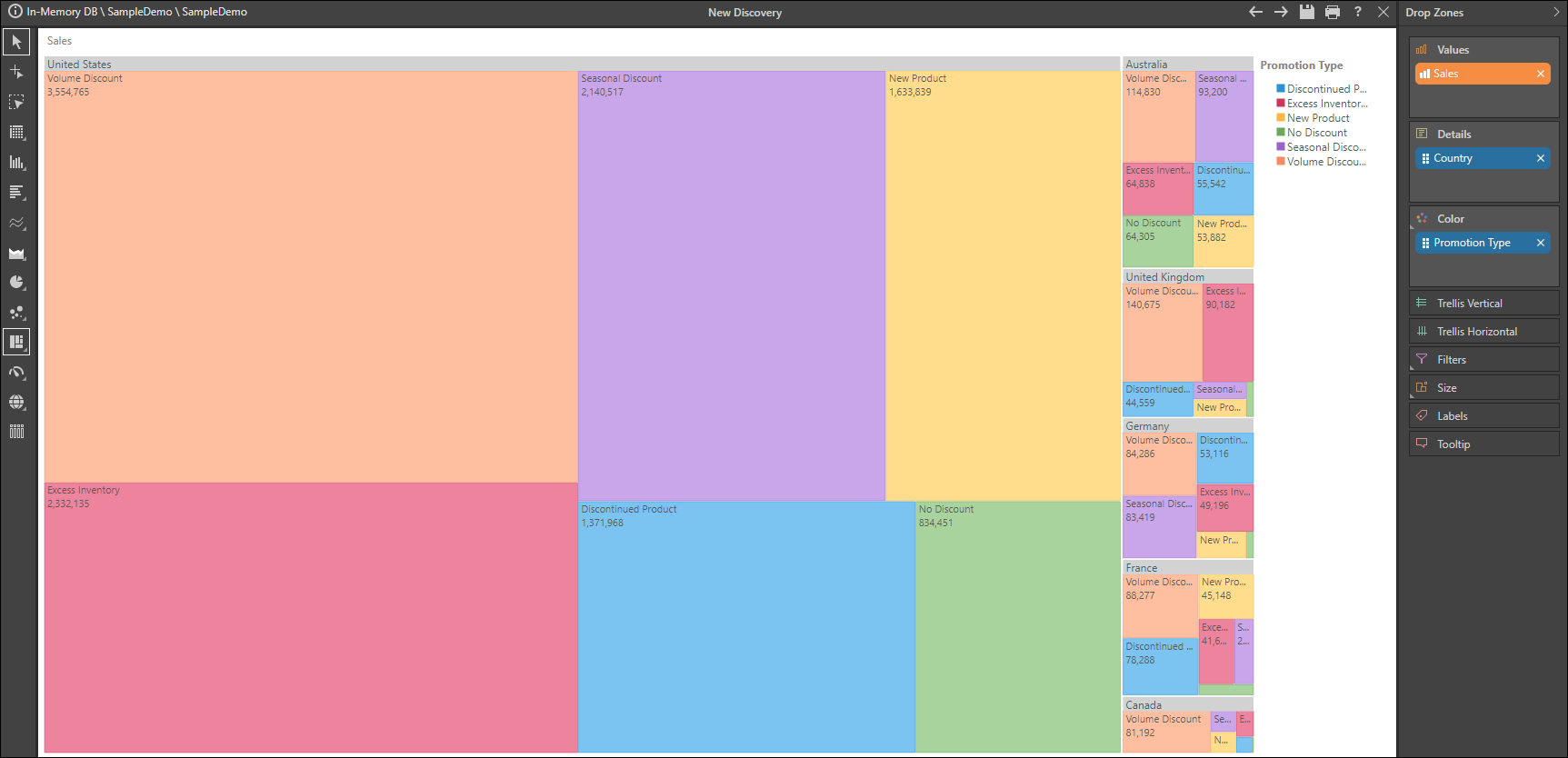
Group by Color
Grouping by color organizes the data by the chips in the Color zone (green arrows below), rather than those in the Details zone, thereby grouping common colors together in the chart. In this case, the member elements in the hierarchy in the in the Details zone will be displayed as labels (red arrows).
To achieve this result, click Group by Color from the Component ribbon (red highlight below).

Examples
Example 1
Step 1
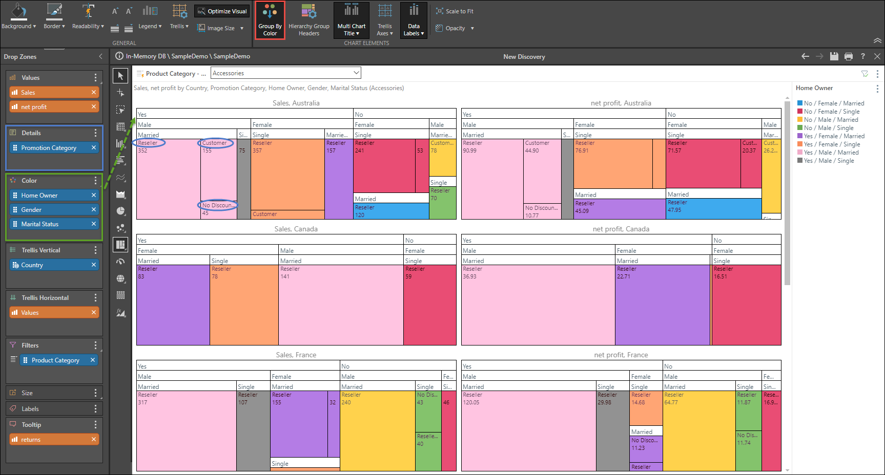
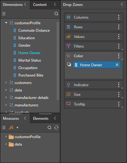
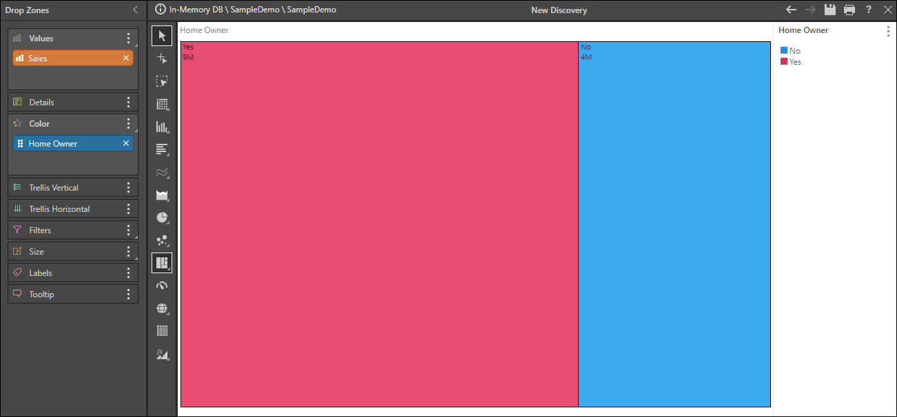
Open the Sample Demo model and add the Home Owner hierarchy to the Color zone.
Step 2
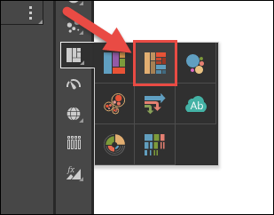
Select Hierarchical Tree Map Chart from the Visualization menu.
Step 3
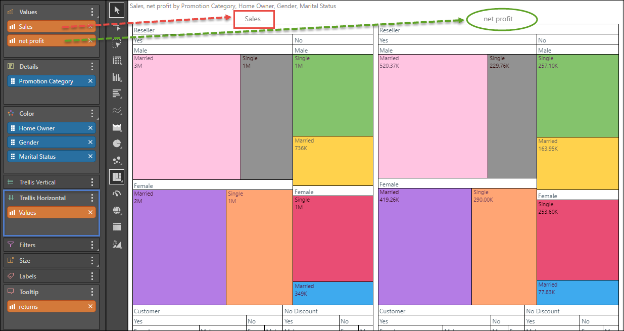
Add the Sales measure to Values.
Step 4
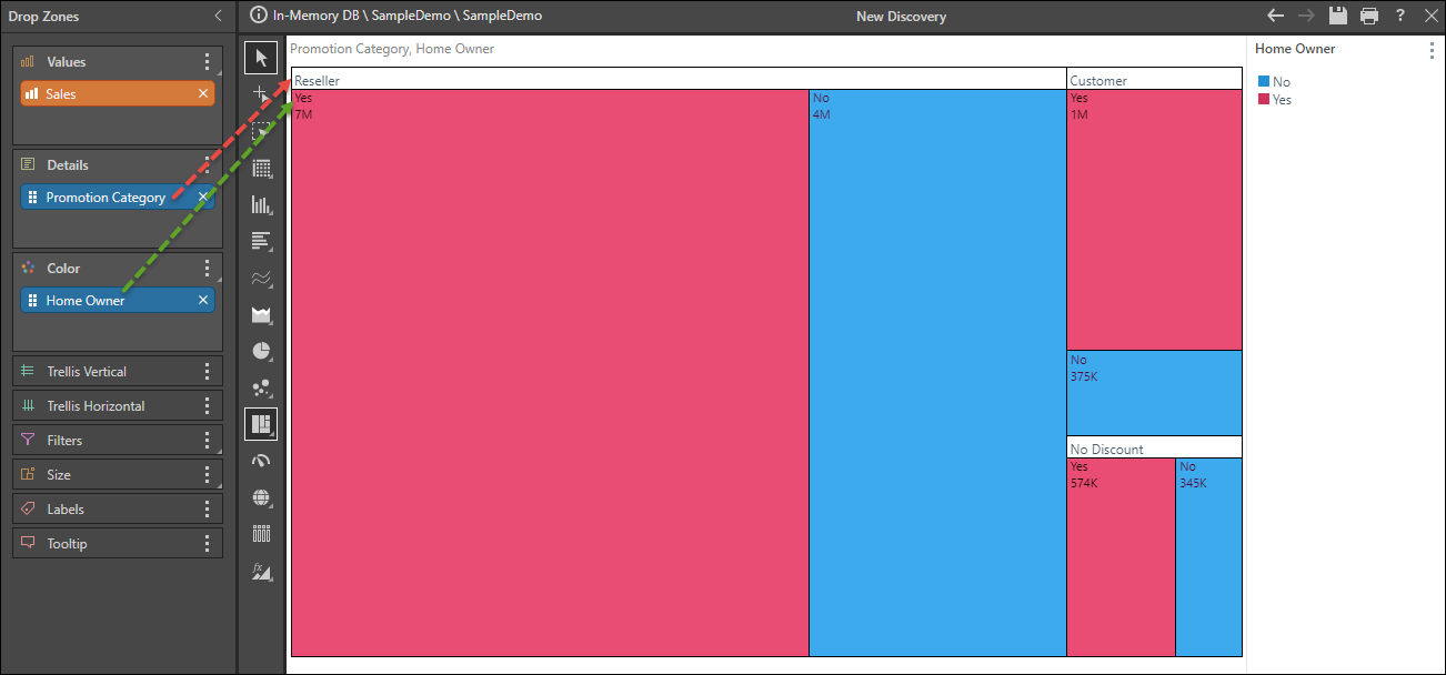
Add the Promotion Category hierarchy to Details.
Step 5
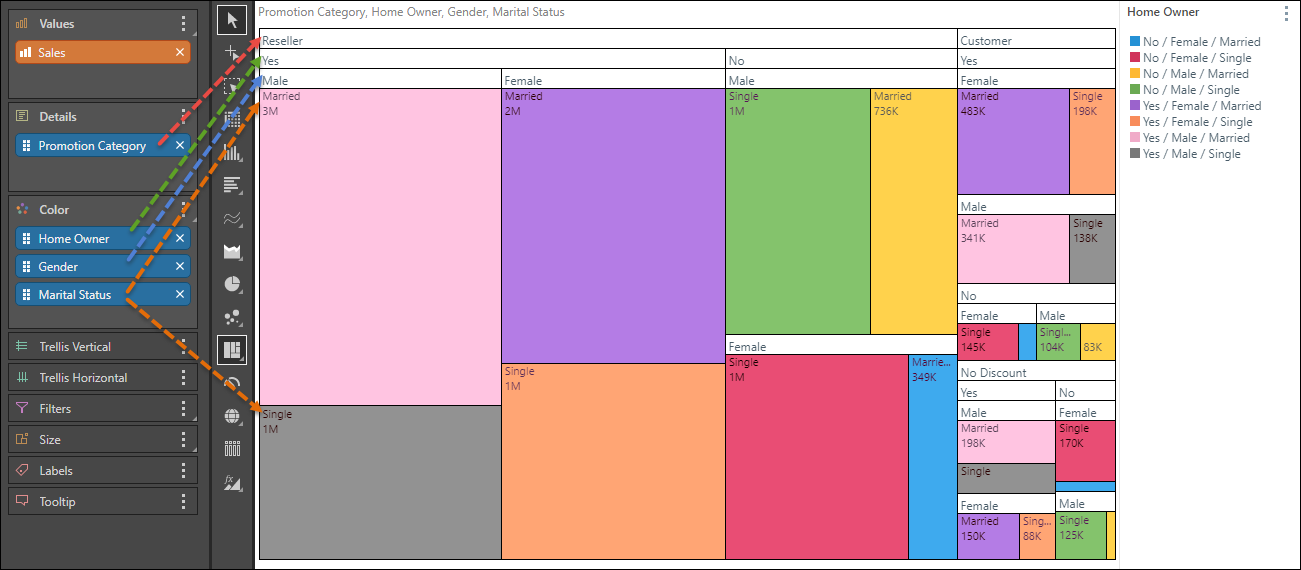
Add the Gender hierarchy to Color, followed by the Marital Status hierarchy.
Example 2
Continue from Example 1, to learn how to use more advanced querying features.
Step 1
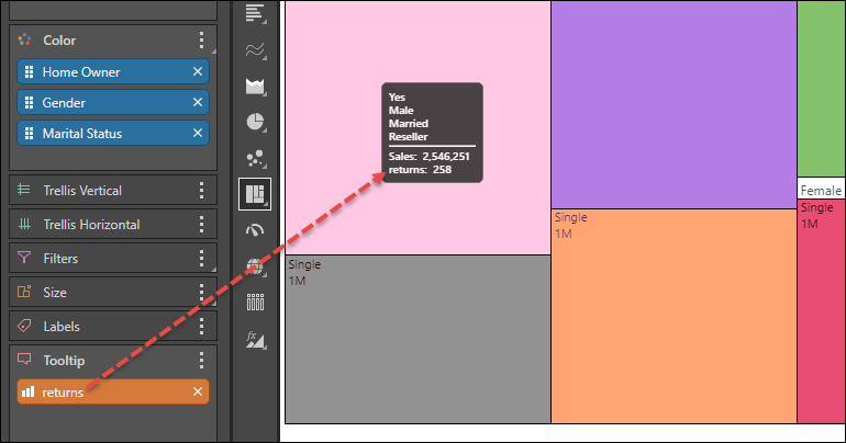
Add the Returns measure to the Tooltip zone to display the returns for each data point in the tooltip.
Step 2
Add the Net Profit measure to Trellis Horizontal to compare sales with net profit in 2 separate charts.
Step 3
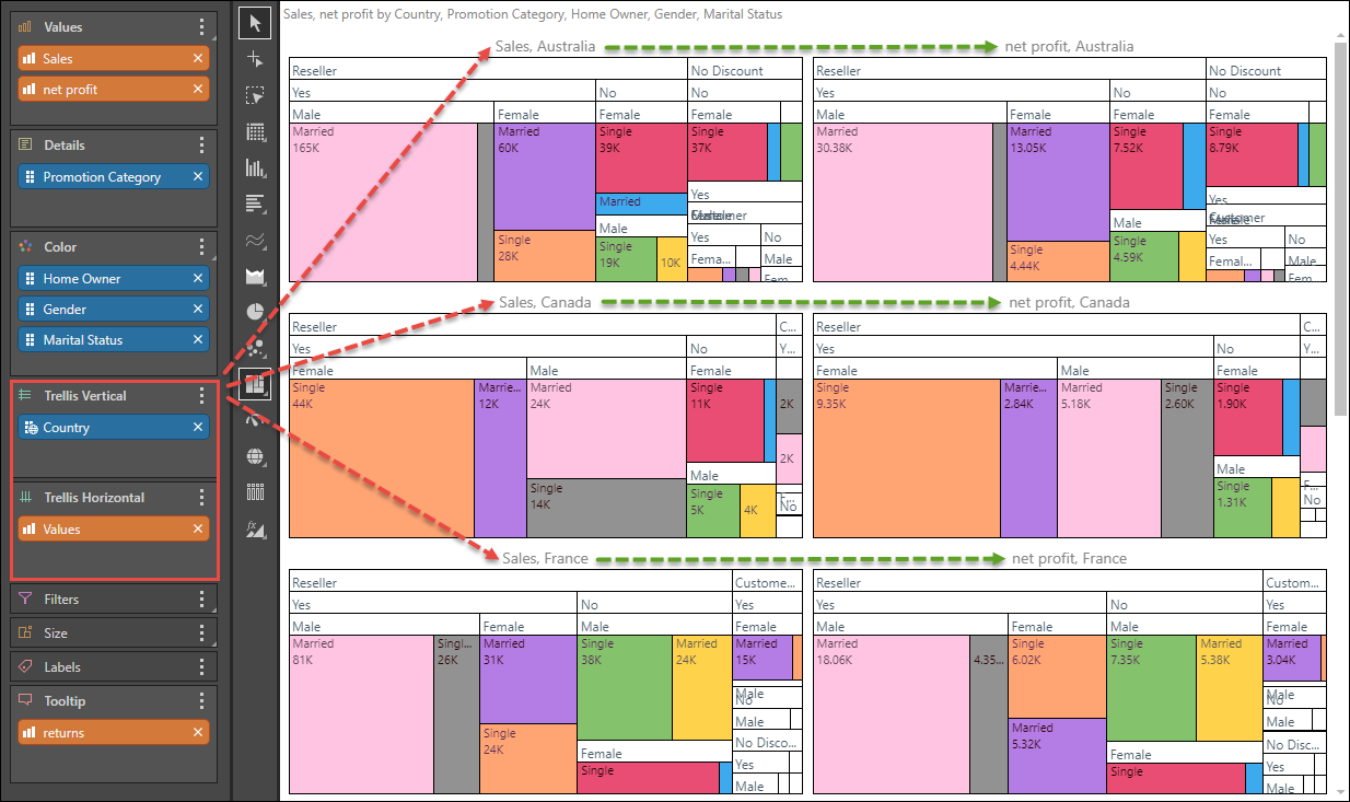
Add the Country hierarchy to Trellis Vertical to create a separate chart for each country; there will now be a chart for every measure and country combination.
Step 4
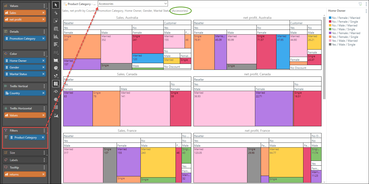
Add the Product Category hierarchy to the Filters zone to create a slicer from which you can filter the query by product category.
Step 5
Click Group by Color from the Component ribbon to organize the data according to color, rather than labels.